(available at myfonts.com and fonts.com)
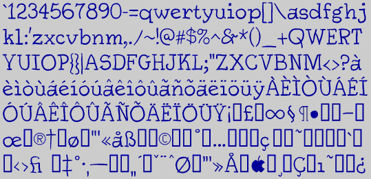
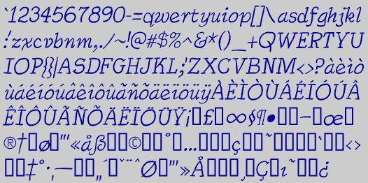
SarahSlob, a sloppy serif, is very similar to Dschoyphul in construction and design, though it was a completely independent effort. The lower case is a bit bigger than that of Dschoyphul. This one also has an italics.
Go to Informal Fonts
Go to S Fonts